

UX Collective: Bringing Accessibility to UX
Estimated Reading Time: 7 Minutes
By: Jon Lee
Share


KEY
POINTS
- When it comes to UX accessibility for users, it is about creating web design that ensures that every user can navigate it with no troubles and access all its information and features.
- Many times, when a web page is being designed, certain aspects of accessibility may be forgotten or even considered optional. But that only serves to harm both users and the companies that would otherwise benefit from those users visiting.
- Always consider what ways you can make your web design more accessible to maximize your reach and audience.
Accessibility has always been a key component of what makes a good UX (or User Experience).
First coined by a professor and researcher of design and usability, Don Norman, UX has been a key principle in both web design and application development. As Norman once said: “I thought human interface and usability were too narrow, I wanted to cover all aspects of the person’s experience”.
In the world of web design, UX accessibility means considering all aspects of how a person may experience a web page, and then creating the means for the user to experience them, even if they would typically have trouble reading, are hard of hearing, or even have physical disabilities that would make it hard to interact with their screen or PC peripherals. UX Accessibility allows these individuals to experience and draw the same information that anyone else can from the web page, creating a more equal user experience.
UX Collective’s Implementation of UX Accessibility
The UX Collective is an independent publication that discusses design and provides helpful articles for designers to learn and improve their craft. But the publication also offers stories that involve UX, visual design, product design, and of course, online accessibility.
True to the very UX principles that the publication preaches, the UX Collective site is quite accessible for users. After testing their website on both PC and on mobile devices, we found that the UX Collective site checks off a number of boxes that would help make the site more accessible even for those with weakened sight or mobility challenges.
Examples of UX Accessibility in the UX Collective Website
Upon entering, you’re greeted with a great example of UX accessibility in the UX Collective website: large and bold text to introduce you quickly and clearly to the latest in their articles and insights.

The header nav gives you clear pathways to their About, social media, subscribing to their newsletter, their Editor Picks for a shortcut to UX Collective’s best content, and even a way to get involved if you wish to try publishing your own insights in the world of UX and design.
The best part—you’re getting all of this without having to scroll. It’s all there from the moment you enter the site. But if looking through their curated content is all you want to do, then scroll away.
Without needing to zoom or squint, it’s easy to see that the layout is meant to make it easy to get a sense of what each article is about. But upon making a couple inquisitive clicks, one also discovers that you can also access the article by either clicking on the bold title or on the highly visible thumbnails.
Upon clicking on an article, it takes you to their choice platform of Medium. Here, they use a no-nonsense format of text and stand-alone images that can be zoomed in with a click or brought to center screen with a click, depending on if you’re using a PC or mobile device.

From their actual website to their content that’s hosted on Medium, UX Collective accomplishes two important principles that we like to emphasize: Keeping things clean and easy and using a UI that defines your brand.
The main page maintains neatly organized article posts with large, easy to press thumbnails for easy access. The large and bold font is black, making use of the white space to create perfect contrast. What’s more, the article titles are clickable, instead of entirely relying on the thumbnail. This helps ensure that there are multiple ways to access the content, and color doesn’t become an issue in trying to provide access to users.
Meanwhile, Medium allows for the articles to remain organized, not overly busy, and focused. You’re either reading the text, or you’re looking at an image that the author wants you to see before carrying on to the next body of text.
This kind of consistent and uniform layout can be incredibly handy, especially for readers who have trouble focusing or get easily overwhelmed by too much sensory stimulation when there’s too much on the screen at once.
Examples of Poor UX Accessibility
Unfortunately, not all websites are as successful at addressing the many points of UX accessibility in web design. That’s not to say that the web designers do not care, but the failing is evident all the same when an element is discovered to be hard to read, hard to see, or inconsistent in its interactivity.

When interacting with this other site, only one of the three images at the top are actually interactive. If the user doesn’t realize that the text beneath each image is meant to be the main interactive buttons, they may find themselves at a loss. Meanwhile, the text below scrolls down with the image of lined up bottles. But the color choice for the word “heritage” sometimes doesn’t clearly show because of the label colors of the bottle in the middle. For some users, especially those with poor eyesight, it will be difficult to tell what the word actually is.
Examples of UX Accessibility in Applications
Accessibility on a web page is crucial, but if a website also offers its services on an app, it is important to have that same level of accessibility as much as possible.
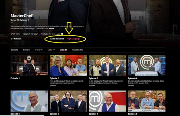
Along with having a simple to navigate UI, good contrast, and big interactive thumbnails for every episode, the BBC iPlayer also offers audio description for the blind and low-vision, and sign language for the deaf and hard-of-hearing.
The Web Should Be for Everyone, UX Accessibility Makes It Happen
The web should be for everyone—UX accessibility makes it happen!
The thing about having the internet open to everyone is that it needs to be actually open to everyone, including those with disabilities, special needs, and other life challenges. Every step towards making the internet more accessible is a step in the right direction.
What’s more, making your website more UX accessible also means allowing in a larger audience. Whether you’re running a streaming service, hosting a personal blog, or maintaining an e-commerce store, UX accessibility helps gives everyone a chance to enjoy what you have to offer. If you’d like to make your website as accessible as possible, you can always find an experienced web designer with expertise in inclusive and accessible UX design.
Need Help With UX Accessibility?
SEO and user satisfaction go hand-in-hand with UX accessibility – optimize your website and create a welcoming space for all visitors, let’s discuss how using the form below.
