

Navigation in Web Design: How Step2 Does It Well
Estimated Reading Time: 13 Minutes
By: Jon Lee
Share


KEY
POINTS
- Navigation is meant to help users efficiently find their way through a website and find the information they need.
- Navigation should include elements like search bars to help users find specific content.
- A consistent navigation layout creates a unified look for a website and reduces the user learning curve in finding information.
Navigation is about incorporating a system that allows users to search through a site efficiently and find the information that they want most. When a successful navigation system is in place, a better user experience (UX) is made possible, reducing user cognitive load and keeping users comfortable.
What is Navigation in Web Design?
Navigation is a core part of web design that has a direct impact on the user experience (UX). Navigation design needs to be intuitive, user-friendly, and efficient to keep users comfortable, engaged, and to help them ultimately find the information they seek. Effective navigation features are especially important for sites such as e-commerce, finance services, and educational sites where navigation features need to be able to find very specific information for users.

What Are the Common Navigation Types Used in Web Design?
The common navigation types used in web design include top navigation bars, side navigation bars, dropdown menus, hamburger menus, and mega menus. Each navigation type plays a role in making navigation easier for users, giving them a reliable place on a webpage to begin navigating the website.
Top Navigation Bar
A top navigation bar is a horizontal bar at the top of a webpage, usually below the webpage’s header. These are ideal for websites that have just a few main categories for users to navigate to.
Side Navigation Bar
A side navigation bar is found either on the left or right side of a webpage. This is ideal for websites that have a whole list of categories.
Search Navigation
Search navigation bars are a popular navigation feature that allows users to find information based on specific phrases or keywords. Search bars are especially useful for large websites that contain a lot of content.
Dropdown Menus
Dropdown menus can be situated at the top or the side of a webpage. Whether it is by clicking or hovering over it, dropdown menus expand vertically or horizontally to offer users with more links.
Mega Menus
Mega menus are large dropdown menus with multiple columns of links that can contain additional content or even images.
Hamburger Menus
Hamburger menus behave like dropdown menus in that they expand when interacted with. But hamburger menus get their name from how they look: an icon with three stacked lines (like a hamburger).
Footer Navigation
Footer navigation involves the placement of links at the bottom of the webpage. These links involve additional content, contact details, additional ways to reach main content, privacy policies, terms of service, and other legal information.
Breadcrumb Navigation
Breadcrumb navigation is a secondary type of navigation where the site’s hierarchy is shown somewhere to help the user understand where they are on a website. The breadcrumb navigation can usually be found near the top of the webpage to find quickly and navigate backwards if desired.
What Are the Common Navigation Structures in Web Design
The common navigation structures in web design revolve around how a website’s menus and links are organized and how they facilitate a user’s exploration of that site. What navigation structure a website uses will depend on what kind of information is being shared and how a brand may want to define a user’s journey across their site. These common navigation structures include hierarchical, sequential, matrix, database, and flat navigation structures.
Hierarchal Structure
A hierarchical structure, also called a tree model, means adopting a top-down approach that establishes a clear hierarchy. Ideal for websites that contain an extensive amount of information that needs to be logically sorted.
Sequential Structure
A sequential structure is for websites that provide a linear user experience, such as with presenting a fixed sequence of already-defined pages that a user will navigate. Often used for experiences such as checkout processes on e-commerce sites.
Matrix Structure
A matrix structure involves allowing users to navigate a website through multiple entry points while being able to access all the same content. Useful for sites that have content that can be categorized and sorted in more than one way.
Database Structure
A database structure allows a website to have its content stored in a database. Depending on the user’s behavior, information is taken from that database and used to dynamically create what the user sees as a result.
Flat Structure
A flat structure involves having all pages and content equally accessible from the homepage, or all accessible from a single menu.
Why Is Navigation Important in Web Design?
Navigation is important in web design because effective navigation ensures that users are able to easily and efficiently reach all of a website’s key information. Without proper navigation design, a website could feel more like a labyrinth for users to feel lost, frustrated, and ultimately leave. When a website has proper navigation design, the overall user experience gets better as it drives website predictability and user comfort up and keeps cognitive load down.

What Are the Key Principles and Best Practices for Navigation?
The key principles and best practices for navigation are meant to enhance a website with greater usability, efficiency, and accessibility. When implemented successfully, users will have a more enjoyable, accessible, and user-friendly experience and be able to find information with ease.
Designing User-Friendly Navigation
Designing user-friendly navigation comes with several requirements. For a website to have user-friendly navigation, it needs to have an intuitive navigation design, simplicity in the site’s navigation, and the site must have consistency and predictability. By ensuring that a website follows these principles and navigation guidelines, the cognitive load and learning curve is reduced, and the user can enjoy a website with a user-friendly design.
Intuitive Navigation Design
Intuitive navigation design is about creating a navigation system that’s easy for users to figure out and use, it should feel natural even for first-time visitors. This helps users in predicting the results of their interactions.
Simplicity in Navigation
Simplicity in navigation aims to make navigation as simple and easy as possible. This is achieved mainly through the avoidance of clutter and focusing only on what elements are really needed.
Consistency and Predictability
Consistency and predictability in website design allows for users to quickly learn how to efficiently and confidently navigate a website.
Accessibility in Navigation
Accessibility in navigation revolves around helping all users, including those with disabilities, to use a website comfortably, easily, and efficiently. Several steps that can be taken to make a website more accessible for all include keyboard accessibility, visual clarity, and responsive design.
Keyboard Accessibility
Keyboard accessibility is about making sure that all a website’s navigation elements are accessible by keyboard navigation. This includes having a logical tab order and ensuring that there are visible focus indicators for when an element is being selected.
Visual Clarity
Visual clarity involves making sure that all navigation text is large enough and readable for all users while also ensuring that color contrast between text and background is high enough for users with visual impairments.
Responsive Design
Responsive design refers to ensuring that a website’s navigation system works just as well on different devices and screen sizes.
How Does Multilingual Navigation Open a Website to a Global Audience?
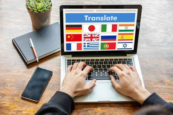
Multilingual navigation is a key part of opening any website to a global audience. Having a multilingual navigation system helps cater to users who may speak different languages, ensuring that the website is accessible to as many people as possible across the globe. Key parts of a successful multilingual navigation system include language selectors, consistently translated navigation elements, and localized content.
Language Selector
A language selector is a website element that allows users to change the displayed language to one they prefer. Usually, language selectors are displayed as dropdown lists in the header or footer of a webpage, but they may also be found in a website’s Settings if they have one.
Automatic language detection is a feature that can be used to detect a user’s preferred language based on their IP address or browser settings, offering users a prompt to switch to a different language if they prefer.
Translated Navigation Elements
Translated navigation elements include menus, links, labels, and any buttons that may facilitate navigation around a website. Any of these translated navigation elements should remain consistent in their translations to avoid confusion for users who are reading the translations.
Localized Content
Localized content refers to ensuring that translations go further and align with the cultural nuances that exist in other languages. This not only can help with local SEO in other parts of the world, but it adds to the accessibility and user experience for all who are visiting a website from other parts of the globe.
What Challenges Are Unique to Mobile Navigation Design?
The challenges unique to mobile navigation design involve certain limitations created by the mobile devices we use such as limited screen real estate, varying screen sizes, the limits of hardware performance, and touch interactions.
Limited Screen Real Estate
Limited screen real estate refers to the fact that mobile devices have much smaller screens than our other display screens such as televisions and computer monitor screens. This makes the amount of information and navigations elements that can be displayed at any one time significantly less on a mobile device. A designer must make wise decisions on how to incorporate mobile navigation elements in a clear manner while not cluttering up the mobile interface.
Varying Screen Sizes
Varying screen sizes means that the navigation elements of a website must be responsive and adapt to the different screens of different mobile devices. This also includes the orientation of those screens whether it’s portrait or landscape. Along with screen sizes, different mobile devices will have different resolutions. The navigation elements of a website must be able to adapt to these resolution changes as well.

Touch Interaction
Touch interaction is a key part of how navigation is completed on a mobile device. That means navigation elements must be large enough to be easily tapped or swiped with a finger. Those navigation elements must also be placed and sized in a way that avoids accidental touch inputs.
Hardware Performance Limitations
Hardware performance limitations are the result of mobile devices having components that are not as powerful as a desktop computer. They are powerful devices, but they will not be able to perform everything as well as a home PC will be capable of. This means performance limitations such as less processing power and slower mobile networks, which in turn means that optimized navigation is a must-have. Also, heavy navigation elements and extreme animations can be taxing on the battery life of a mobile device, and so these should be accounted for when designing for mobile navigation.
What Innovative Solutions Have Been Developed for Navigation?
Innovative solutions for navigation are continually being developed, each with the goal of making navigation more intuitive and efficient for the user. Some of the most recent advancements include voice-activated navigation, gesture-based navigation, and AI-powered predictive navigation.
Voice-Activated Navigation
Voice-activated navigation allows a user to navigate websites by utilizing different voice commands. Voice-activated navigation helps reduce the effort needed to find information. This navigation solution is naturally inclusive, helping users with different abilities be able to explore the internet with their voice. Thanks to voice recognition technologies such as Google Search, Amazon’s Alexa, and Apple’s Siri, this technology continues to grow in popularity and in use.
Gesture-Based Navigation
Gesture-based navigation revolves around the use of touch and gesture controls to interact with a website. This form of navigation is especially popular on mobile devices and tablets. Gesture-based navigation allows for even more intuitive interactions. It also offers a level of accessibility for those who may need a different way of navigating the web versus traditional forms of input like mouse-and-keyboard.
AI-Powered Predictive Navigation
AI-powered predictive navigation offers users a new way to navigate websites using artificial intelligence to anticipate the needs of users by analyzing user behavior and preferences. With continued advancements in AI, users can enjoy more personalization, discover site content that they might not have found on their own, and save time on finding content on a website that is relevant to their interests.
What Unique Kinds of Navigation Exist in Web Design?
There are unique kinds of navigation that exist in web design with each based on the needs and functions of certain websites. For two website categories, e-commerce and content-heavy websites, the information they contain, and the needs of their users often require that they have certain navigation elements that other sites don’t typically have.

E-Commerce Navigation
E-commerce navigation is critical to the success of any e-commerce business with an online presence. E-commerce websites have unique requirements to ensure that users can successfully navigate and find the information or products that they want. Key components of an e-commerce navigation system include product organization (categories, sub-categories, etc), product search bar with filtering and sorting, user accounts, and a shopping cart function.
Product Organization
Product organization involves categorizing products into categories and sub-categories so that users can explore those products in a logical structure.
Search Bar
The search bar enables users to search for specific products by entering keywords. But e-commerce sites will often include the ability to further filter and sort to improve a user’s search results.
User Accounts
User accounts are a section of a website for users to create and manage their own personal accounts. On these user accounts, users can typically view their order history, change personal settings, and access other unique features.
Shopping Cart Function
A shopping cart function allows users to select and save their desired products in one place until check out. Common features in shopping cart functions include applying discounts, estimate shipping costs, and even remove products from a shopping cart to save them for later.
Content-Heavy Website Navigation
Content-heavy website navigation involves the handling of massive amounts of content with a need to organize that content effectively so that users can easily find what they want. News sites and blogs commonly use content-heavy website navigation to manage all their articles and make them searchable. Key components to a content-heavy website navigation system include the use of categories, tags, archives, search bars, and content filters.
Categories
Categories are a way to organize a website’s many articles into different topics, separating breaking news from older articles, and creating a hierarchy for the website’s different topic categories and their subcategories.
Tags
Tags are a way of providing users with additional paths to the content they are looking for. Tags attach additional keywords and phrases to content, improving discoverability through contextual relevance.
Archives
Archives are where past content can be organized and stored effectively for long-term access. This way, users will know precisely where to go to find older content that exists outside of recent posts.
Search Bars and Content Filters
Search bars and content filters assist users in finding their desired content quickly and precisely. With the aid of content filters, articles can be easily found based on keywords, dates published, and even author name.
What Are Some Effective Examples of Navigation in Web Design?
Some effective examples of navigation in web design include the use of multiple types of navigation such as using top navigation and mega menus, maintaining consistency in navigation such as with sticky headers and footer navigation on every page, and including the all-important search bar to ensure that users can find exactly what they want in a quick and efficient manner.
One website that utilizes these effective examples is the website for Step2. Using more than one effective example of navigation and the unique navigation features of an e-commerce site, Step2 provides visitors with a user-friendly experience where it’s easy to navigate and find your products.
What is Step2?
Step2 is an Ohio-based company and one of the largest manufacturers of preschool and toddler toys. It also makes other home products such as outdoor furniture. One of their early products included their iconic MailMaster mailboxes that are still sold today.
Just as their products, like their MailMaster, are easy to use, their website has proven itself well-designed for easy navigation so that customers can easily browse and find their products.

Multiple Navigation Types
Step2 leverages multiple navigation types to neatly organize their large amount of content and products including a top navigation bar, regular dropdown menus, mega menus, breadcrumb navigation and footer navigation.
Upon first entering the site, the top navigation bar is divided into two halves by the Step2 logo. On the right side, some top navigation bar links are positioned next to a convenient search bar, the user account button, and the shopping cart button, all positioned where they typically would be found on many e-commerce sites.
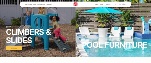
On the left side of the top navigation bar, is a mix of a “New Arrivals” link that takes you to a dedicated page, two dropdown menus, and one mega menu showcasing “Featured” products. Each of these navigation types is being leveraged to meet specific purposes. The “Featured” mega menu is ideal for showing off what Step2 would like the user to really see. The “Kids” and “Home & Patio” dropdown menus have large collections of products and so are better suited to have their dropdown lists. Meanwhile, the “New Arrivals” also has a collection of items to show, but since they’re all kept on one page, it is maintained as a single link in the top navigation bar.

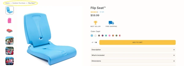
Upon a closer investigation into their product pages, breadcrumb navigation becomes available to help the user backtrack if they wish.
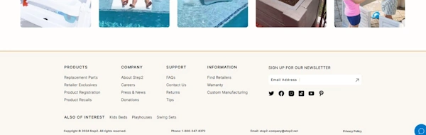
At the bottom of the page. Step2 has a footer navigation section, with links to their About Us, FAQs, Contact Us, and other links.
User-Friendly Design: Consistency and Predictability
Step2 does a marvelous job at maintaining consistency and predictability in their navigation design. As a user explores the website, the top navigation bar sticks around on-screen as a sticky header, ensuring that the user’s never far from it. What’s more, that means having the search bar easy to always access, which is a big plus for search functionality. These points of consistency provide a boost to user comfort (no need to scroll to the top of the screen each time to navigate elsewhere) and drive overall user experience up.
The footer navigation is another navigation component that remains consistent, always waiting at the bottom of the screen with those important FAQs and Contact Us links that users may want at any moment. Since the footer navigation contains all the links that you may expect on an e-commerce site, it certainly helps in predictability, which reduces cognitive load and enhances user experience.
FAQs
What Are Best Practices for Mobile Navigation?
The best practices for mobile navigation include adopting a responsive design for your website, using mobile-friendly navigation elements such as hamburger menus (to conserve space until a menu is required) and bottom navigation bars (ideal for thumbs to reach), ensuring that your interactive elements are touch-friendly, and focusing on simplicity and accessibility in the navigation design.
What Are Some Common Mistakes to Avoid in Website Navigation?
Some common mistakes to avoid in website navigation include overloading navigation areas with too many links, unclear labeling for navigation elements, inconsistency in navigation design, poor optimization for mobile navigation, and not taking accessibility into consideration.
How Can Search Functionality Be Improved on A Website?
Search functionality can be improved on a website with the implementation of autocomplete functions, including advanced filter options, and ensuring that the search bar is easy to access (such as always having it available while exploring a website).
Revisit A Section
- What is Navigation in Web Design?
- What Are the Common Navigation Types Used in Web Design?
- Top Navigation Bar
- Side Navigation Bar
- Search Navigation
- Dropdown Menus
- Mega Menus
- Hamburger Menus
- Footer Navigation
- Breadcrumb Navigation
- What Are the Common Navigation Structures in Web Design
- Hierarchal Structure
- Sequential Structure
- Matrix Structure
- Database Structure
- Flat Structure
- Why Is Navigation Important in Web Design?
- What Are the Key Principles and Best Practices for Navigation?
- Designing User-Friendly Navigation
- Intuitive Navigation Design
- Simplicity in Navigation
- Consistency and Predictability
- Accessibility in Navigation
- Keyboard Accessibility
- Visual Clarity
- Responsive Design
- How Does Multilingual Navigation Open a Website to a Global Audience?
- Language Selector
- Translated Navigation Elements
- Localized Content
- What Challenges Are Unique to Mobile Navigation Design?
- Limited Screen Real Estate
- Varying Screen Sizes
- Touch Interaction
- Hardware Performance Limitations
- What Innovative Solutions Have Been Developed for Navigation?
- Voice-Activated Navigation
- Gesture-Based Navigation
- AI-Powered Predictive Navigation
- What Unique Kinds of Navigation Exist in Web Design?
- E-Commerce Navigation
- Product Organization
- Search Bar
- User Accounts
- Shopping Cart Function
- Content-Heavy Website Navigation
- Categories
- Tags
- Archives
- Search Bars and Content Filters
- What Are Some Effective Examples of Navigation in Web Design?
- What is Step2?
- Multiple Navigation Types
- User-Friendly Design: Consistency and Predictability
- FAQs
- What Are Best Practices for Mobile Navigation?
- What Are Some Common Mistakes to Avoid in Website Navigation?
- How Can Search Functionality Be Improved on A Website?
