

Maximizing the Use of Contrast: How Allbirds Does It Great
Estimated Reading Time: 13 Minutes
By: Jon Lee
Share


KEY
POINTS
- Contrast plays a key role in visibility and readability on a website or application.
- Contrast can assist in the organization of a website or application by further differentiating sections or various elements, assisting users in intuitively understanding information or the function of something.
- Contrast can be leveraged to draw attention to a specific part of a webpage or application, such as a call-to-action or a button that should be pressed.
Maximizing the use of contrast in UX design requires an understanding of layout, colors, typography, and even how to utilize white space. Understanding how to use contrast effectively can improve website or application usability, accessibility, and helps establish a visual hierarchy for more intuitive navigation. Contrast also serves to help emphasize the importance of certain elements that you want to draw the user’s attention. Proper contrast can mean the difference between an easy user journey towards conversion or a user who becomes lost and disengaged.
What is Contrast in UX Design?
Contrast in UX design refers to the organization and arrangement of elements that highlight one another through their differences. Some examples of contrast include the use of different colors, shapes, elements of different sizes, and even just their placement on a website or application interface.

Why is Contrast Important in UX Design?
Contrast is important in UX design because of how it impacts accessibility, user interaction, and the overall aesthetics of a website or application.
Effective use of contrast can create greater visual interest and engagement for the user, and it can help guide the user to certain elements that you want them to see or interact with in order to progress down the intended user journey. Using contrast effectively is also a part of making a website or application more accessible, especially for those with vision impairments.
What Are the Different Types of Contrast in UX Design?
The different types of contrast in UX design include color contrast, size contrast, shape contrast, texture contrast, and space contrast. Each of these serves to help in making an interface more effective in guiding user attention, framing important elements, and making the interface more accessible for all users.
How is Color Contrast in UX Design Used?
Color contrast in UX Design is used to make different design elements more noticeable and easier to pick out. This can refer to making text more readable by giving it a well-contrasted background, using bright colors to make a CTA button stand out well on a hero image that uses darker colors, or helping make an alert message really stand out by giving it a stark color contrast to draw user attention quickly. Brands also use color contrast to help establish their brand identity and create logos that are memorable.

How Does Size Contrast in UX Design Work?
Size contrast in UX design works by giving an interface’s many elements different sizes. This aids in establishing a visual hierarchy and giving emphasis to the most important elements. Some examples of size contrast include the difference between headings and body text, having larger buttons for primary interactions and presenting smaller buttons for secondary kinds of interactions.
How Do Shape Contrasts Improve UX Design?
Shape contrasts improve UX design by using different shapes to help distinguish an interface’s various elements. This also serves to enhance the user experience with unique visuals. One example of shape contrast at work includes creating icons of different shapes to help mark different categories or to better indicate the different actions that those icons may do if interacted with.
What Does Texture Contrast Do for UX Design?
Texture contrast in UX design improves the user experience by adding depth and even tactile differences to an interface. User navigation is improved when textured backgrounds are used to help the user distinguish between different sections or parts of a website or application. Textured buttons stand out well and help indicate to users that they are interactive, giving usability a boost.
What is Space Contrast in UX Design?
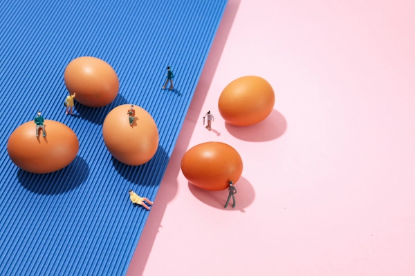
Space contrast in UX design is also known as white space, which is used to help strategically separate the different elements of an interface. Space contrast can be utilized to frame important elements with white space to focus a user’s attention. Space contrast also serves to improve readability, accessibility, and improve an interface’s overall visual appeal.
What Are the Benefits of Proper Contrast in UX Design?
The benefits of proper contrast in UX design include improvements to an interface’s readability, accessibility, and even enhancing user navigation.
How Does Contrast Enhance Readability?
Contrast enhances the readability of text and other visual elements on a website or application’s interface. In turn, this will make any content more user-friendly and accessible to all users. Some examples of this include using high contrast to make text stand out from its background, like the classic black text on white background or white text on black background.

Contrast for readability can also be used to make certain parts of text bold, colored, or just a different size. This makes them even more noticeable and readable, serving to draw user attention as those portions of text are given added contrast with the surrounding text.

How Does Contrast Improve Navigation?
Contrast improves navigation by making different elements stand out so that users are better able to find and interact with them. Contrast can help emphasize navigation elements such as navigation menus, buttons, and links, making it easier for users to identify them and use them. This technique can also help guide users towards the primary navigation elements first.
How is Contrast Used to Create Visual Hierarchy?
Contrast is used to create visual hierarchy by organizing content to create clear distinctions between elements based on their level of importance. This serves to guide a user’s attention to particular parts of a website or application interface, ensuring interaction and making user navigation easier and more intuitive.
User attention can be drawn and guided with the use of contrasting colors, typography, image size, and utilizing space between elements. By using these techniques, users will pay more attention to the most important elements.

Why Use Contrast to Highlight Key Elements Like Interactive Elements?
Contrast highlights key elements like interactive elements to ensure greater user engagement and usability. By utilizing effective contrast techniques, interactive elements can become more noticeable and easier to user, which ultimately boosts the overall user experience.
Some of the ways that contrast can be used with interactive elements include changing the color of a button as a hover effect to provide interactive feedback and suggest to the user to click on an important element. Subtle animations and changing the size of interactive elements are other ways to focus the user’s attention and encourage them to interact with an element, or they can be used to provide feedback and indicate to the user that their interaction has been registered.
What is the Role of Contrast in Accessibility?
The role of contrast in accessibility is to make sure that the content of a website or application is made accessible to all users, including those with disabilities and visual impairments. According to the WCAG, the minimum contrast ratios to make text readable for users with visual impairments is 4.5:1 for regular text and 3:1 for large text. Large text is defined as anything of 14pt bold or 18pt regular and higher.
Accessibility can be improved when contrast is used to make buttons, links, and form fields easily distinguishable from their backgrounds. Contrasting colors can be used to help provide clear visual feedback when a user is interacting with various elements, whether it is clicking a button or simply hovering a mouse over something.
What is the Psychological Impact of Contrast in UX Design?
The psychological impact of contrast in UX design revolves around contrast’s ability to guide the user’s attention and focus, improve readability and user comprehension, encourage emotional response from the user, aid in memory and recognition, and influence user actions and behavior.
User Attention and Focus
User attention and focus can be guided with the use of different types of contrast. By using contrast such as space contrast to frame important elements, users can better focus on those elements and be encouraged to interact with it.
Readability and Comprehension
When contrast improves readability, it makes it easier for users to read, view, and understand the different elements on a website or application. In turn, this enhances user comfort and elevates user satisfaction.
Emotional Response
Contrast can create an emotional response within a user, using color contrast to influence the user’s mood and adjust the tone of an interface. For example, high contrast color designs may feel more energetic, lower contrast color designs may feel relaxed and steady.
Memory and Recognition
When it comes to memory and recognition, the same eye-catching and attention-grabbing qualities of high contrast designs can be used to take the user’s mind further and help them remember important information and key interactions on a website or application.
User Actions and Behavior
Contrast can guide user actions and behavior when used to highlight interactive elements and important content. Contrast can also be used to make warnings more visible so that users can avoid potential mistakes and errors.
How Should Contrast Be Used in Mobile UX Design
Contrast in Mobile UX Design should be used to enhance usability, readability, and accessibility for mobile device users.
Special Considerations for Contrast on Smaller Screens
Special considerations for contrast on smaller screens include making every bit of screen real estate count. Every element must be optimized so that they are clearly visible to the user, but balance must be maintained to avoid overcrowding. Considering how mobile devices get used during both bright sunny days and dim evenings, it is also important to have a high enough contrast to ensure that readability remains the same for users no matter the time of day.
Size and shape contrast can be used to help indicate touch targets to users, such as making interactive elements larger so that users know that they are interactive, and it is easier for them to touch those elements. Color and texture contrast may also play a role in providing visible feedback when these touch targets are being interacted with on a mobile screen.

Effective Color Contrast for Creating Mobile Color Schemes
Effective color contrast for creating mobile color schemes involves selecting well-contrasted colors to help indicate to users what their primary touch targets are and what their secondary touch targets are. These contrasting colors should remain consistent through an interface to ensure that users quickly learn and get used to navigating and interacting with the interface. These colors should also align with the brand involved while still adhering to accessibility needs.
Dark modes and contrast adjustment controls should be made available as other forms of contrast to provide all users with the ability to maximize their readability and eye comfort.
Responsive Design and Contrast for Mobile
Responsive design and contrast for mobile come together when a design team needs to make sure that contrasting elements remain consistent throughout the user experience, regardless of the device being used, the screen size, or even the orientation of the screen.
What Are Common Mistakes with Contrast in UX Design?
Common mistakes with contrast in UX design include overusing contrast, ignoring proper contrast ratios, using poor color combinations, having a lack of consistency, and neglecting to test designs to ensure that they are effective. Learning about these common mistakes can help any design team avoid making the same mistakes on their own projects.
Overusing Contrast
Overusing contrast refers to using too much contrast to the point that it becomes distracting, chaotic, and even overwhelms the user until they cannot determine what the most important elements are.
Ignoring Proper Contrast Ratios
Ignoring proper contrast ratios can result in accessibility problems as users, especially those with visual impairments, find themselves unable to clearly read a website or application’s different elements.
Poor Color Combinations
Poor color combinations refer to choosing colors that either clash to the point of being uncomfortable and disengaging or choosing colors that are difficult for users with color blindness to see properly.
Lack of Consistency
A lack of consistency in contrast can create user confusion and hinder the overall user experience. Also, a lack of consistency can weaken a brand’s identity and give users the sense that a website or application is a poorly designed product.
Neglecting to Test Designs
Neglecting to test designs may lead to the overlooking of existing contrast issues. If any contrast issues make it to the released version of a website or application, it can harm the usability, accessibility, and overall user experience of the interface.
What Are Some Examples of Effective Contrast in UX Design?
Some examples of effective contrast in UX design include creating high contrast between an interface’s text and the background, using contrast to make interactive elements like buttons and menus stand out for users, improving user comfort by using contrast to enhance readability, guiding user behavior with high contrast buttons to encourage the completion of key tasks.
Who is Allbirds?
Allbirds is a footwear company with an emphasis on sustainability, using natural materials in place of petroleum-based products where possible. They also sell other related products such as hats, socks, shirts, and underwear.

Just as Allbirds stands out as a footwear company that puts sustainability first, their website also knows how to make their products effectively stand out with proper contrast in their UX design.
Contrast on Allbirds
Contrast on Allbirds is successfully executed with a combination of contrasted text, imagery, interactive elements, and the productive use of white space.
The header nav uses a nice, dark text to stand out against the white background of the header. Many other parts of the homepage utilize contrast to bring out the big images, make interactive buttons more noticeable, and to make the test altogether more readable which is good for accessibility.

Even with the off-white background and the generous amount of white space in some sections, the Allbirds website uses that white space to its advantage!
Space Contrast: Using White Space
The Allbirds website uses white space in an artfully balanced manner. While the Allbirds website sports a number of big images that span the width of the page, they are broken up by bands of white space that contain either center-aligned smaller galleries or bits of text with interactive buttons. The big images can speak for themselves, but with the white space between each of those big images, the smaller galleries and text must use effective contrast to stand out and attract the user’s attention.
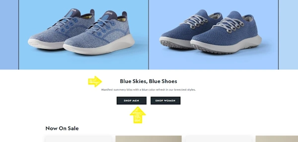
For example, after a display banner containing two images of two different types of shoes, the Allbirds site breaks it up with a small body of text with the header “Blue Skies, Blue Shoes”. Observe how, even though it’s in a wide band of white space, it makes 100% use of what space it takes up by using strong contrast. As the user’s mouse hovers over the “Shop Men” or “Shop Women” buttons, they also change color to further cement user attention and prompt further interaction.
Contrast Successfully Combined with Interactivity
Contrast is successfully combined with interactivity through the use of hover effects for many of the website’s well-contrasted buttons.
For example, the header navigation elements use hover effects to provide feedback to the user and encourage interaction.
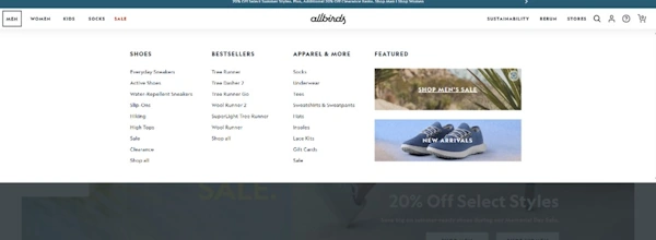
Below the header, an interactive big image greets the user, again with hover effects for the “Featured” items on the left side of the image and the “Shop Men” and “Shop Women” buttons on the right that change to a well-contrasted black whenever the mouse hovers over them. These offer the user a rich amount of feedback with highly noticeable effects to draw the attention and prompt further investigation.

FAQs
What Are the Best Practices for Applying Color Contrast?
The best practices for applying color contrast in a website or application involve understanding color theory, choosing effective color combinations, and designing for accessibility. While following these best practices, it is also important to remember that color is also used to maintain brand integrity and can also be leveraged to evoke emotion.
What Are Emerging Trends and Innovations in the Use of Contrast in UX?
Some emerging trends and innovations in the use of contrast in UX include the implementation of adaptive contrast, Dark Mode, user-selected color themes, and even the use of gradients and overlays to maintain readability over a background or images that change. These various and relatively new features assist in creating a more accessible and engaging experience for many users.
Revisit A Section
- What is Contrast in UX Design?
- Why is Contrast Important in UX Design?
- What Are the Different Types of Contrast in UX Design?
- How is Color Contrast in UX Design Used?
- How Does Size Contrast in UX Design Work?
- How Do Shape Contrasts Improve UX Design?
- What Does Texture Contrast Do for UX Design?
- What is Space Contrast in UX Design?
- What Are the Benefits of Proper Contrast in UX Design?
- How Does Contrast Enhance Readability?
- How Does Contrast Improve Navigation?
- How is Contrast Used to Create Visual Hierarchy?
- Why Use Contrast to Highlight Key Elements Like Interactive Elements?
- What is the Role of Contrast in Accessibility?
- What is the Psychological Impact of Contrast in UX Design?
- User Attention and Focus
- Readability and Comprehension
- Emotional Response
- Memory and Recognition
- User Actions and Behavior
- How Should Contrast Be Used in Mobile UX Design
- Special Considerations for Contrast on Smaller Screens
- Effective Color Contrast for Creating Mobile Color Schemes
- Responsive Design and Contrast for Mobile
- What Are Common Mistakes with Contrast in UX Design?
- Overusing Contrast
- Ignoring Proper Contrast Ratios
- Poor Color Combinations
- Lack of Consistency
- Neglecting to Test Designs
- What Are Some Examples of Effective Contrast in UX Design?
- Who is Allbirds?
- Contrast on Allbirds
- Space Contrast: Using White Space
- Contrast Successfully Combined with Interactivity
- FAQs
- What Are the Best Practices for Applying Color Contrast?
- What Are Emerging Trends and Innovations in the Use of Contrast in UX?
