

Effective Content Layout: A Study of the Nielsen Norman Group
Estimated Reading Time: 11 Minutes
By: Jon Lee
Share


KEY
POINTS
- Effective content layouts provide guidance for the user’s attention and improve useability for a website or application as a whole.
- Content layout has a direct impact on accessibility and readability.
- A content layout should be able to adapt to new content, features, and other forms of scaling.
Content layout in UX design is more than just making your website or application look organized. Understanding the importance of content layout is vital to ensuring that your users and visitors can successfully navigate your site or interface while following the intended user journey. An effective content layout can make the difference in creating another converted customer or securing user loyalty.

What is Content Layout in UX Design?
Content layout in UX design is about strategically placing and arranging different elements and information with the intention of improving user interaction with your application or website. The different elements of a content layout include imagery, text, icons, interactive buttons, drop-down menus, and other interactive features.
Ultimately, the goal of a content layout is to provide users and visitors with an easy-to-navigate interface or website with optimized readability, accessibility, and an intuitive visual flow.
Why is Content Layout Important in UX Design?
Content layout is important in UX design because of its direct impact on the way users interact and perceive a website or application. When a content layout is well-structured, users get to experience better usability, improved readability, and seamless navigation as the user is guided through the intended user journey.

Content Layout Enhances Readability and Comprehension
Content layout enhances readability and comprehension by providing clear organization and an established visual hierarchy. With the proper use of headings, subheadings, and paragraphs, users can easily find the information they want and all they need to do is quickly scan through the page. The balanced use of white space also aids in creating this clear organization, framing important content and keeping the layout from looking cluttered. A proper content layout that has consistent styling in its font, element sizes, and color choices will also help improve readability for the user as they will be able to distinguish between different pieces of content easily.
Content Layout Improves Usability
Content layout improves usability when it is user-centered and is shaped to consider the needs of all users, including those with various disabilities. When content layout includes accessible font, colors, navigation elements, and adopts a responsive design, usability becomes maximized, users can find their information quickly, and a brand can enjoy a much larger audience.
Content Layout Improves Navigation
Content layout improves navigation by guiding users down a logical and intuitive path through a website or application’s content. In turn, this helps encourage the users to explore further down the intended user journey without needing to think too much. An effective content layout will also use interactive elements like buttons and links to further make the navigation experience easier and more intuitive.

What are the Key Principles of Content Layout in UX Design?
The key principles of content layout in UX design involve establishing a visual hierarchy, utilizing white space effectively, maintaining consistency throughout all pages, utilizing grid systems and alignment, adopting a responsive design, and focusing on the needs of the user.
Establishing a Visual Hierarchy
The key principles of content layout in UX design involve establishing a visual hierarchy, utilizing white space effectively, maintaining consistency throughout all pages, utilizing grid systems and alignment, adopting a responsive design, and focusing on the needs of the user.
Consistency in Content Layout
Consistency in content layout refers to maintaining a uniform design using style guides and component libraries. This ensures that there is a cohesive appearance and feel to all the pages on a website or application.
Using Grid Systems and Alignmen
Proper alignment in grid systems adds to the structural organization of a webpage or application interface, making it look orderly and neat. Grid systems are ideal for creating a consistent and organized layout.
Adopting a Responsive Design
Adopting a responsive design provides a consistent user experience across different devices such as smartphones, tablets, and home desktops. Responsive design is for not just different screen sizes and resolutions, but also different orientations.
Focusing on User Needs
Focusing on user needs and creating a user-centered design requires conducting user tests and performing user research to better understand what your target audience needs and expects.
The History and Evolution of Content Layouts
The history and evolution of content layouts have closely followed changes in technology, user needs and expectations, and the shift towards more responsive, accessible, and user-centric designs.
The Early Days (1990s)
During the early days, the beginning of the Internet age, GUIs were only just being introduced. Interfaces had basic grid layouts and were limited in color and typography. Early websites were mainly text-based and there was little consideration for aesthetics due to limited tools—most of the focus was on functionality.
The Rise of Web and Mobile Interfaces (Late 90s to Early 2000s)
Web and mobile interfaces rose with the continued proliferation of internet use and the introduction of mobile devices like PDAs and the early models of cellphones. For the internet, many web pages had static content layouts and had limited focus on visual hierarchy—it was common for websites to have cluttered layouts with a lot of flashy buttons, but little consideration for actual usability and user experience.
Web 2.0 and Early Mobile UX (Mid-2000s)
The arrival of the Web 2.0 era saw to the rise of more user-centric websites and web applications. Smartphones and tablets became more popular, which created the need for more responsive design to adapt content layouts to different screen sizes and orientations.
A Focus on User-Centered Design (2010s to Present Day)
User-centered design has now taken center stage. Websites and application interfaces today have content layouts designed for usability, creating more user-friendly interfaces that were intuitive, and placing greater emphasis on having clearer information architecture where navigation is easier, and content is organized in a logical fashion. With the continued rise of AI, VR, and AR technologies, content layouts will likely see even greater personalization based on a user’s unique preferences and behaviors. This will likely open doors to creating content layouts that offer even more adaptive, engaging, and inclusive user experiences.

How Does Content Layout Influence User Experience?
Content layout has a significant influence on user experience by organizing the placement of information, visual elements, and interactive components. By improving navigability, readability, and accessibility, a proper content layout can reduce user cognitive load, retain user engagement for longer, and guide them through the intended user journey.
How to Analyze User Behavior for UX Design?
Analyzing user behavior for UX design can be accomplished through different methods and tools. It is important to understand user behavior to ensure that a content layout is as effective as it should be. Some of those methods and tools include user surveys, usability testing, web analytics, heatmaps, session recordings, and A/B testing.
User Surveys
User surveys are a popular way to gather direct feedback from users, both to learn of problems that need fixing and to gain a sense of user sentiment about a website or application. Other effective variations of gathering user feedback include one-on-one user interviews and focus groups.
Usability Testing
Usability testing can be done in two ways: Moderated usability testing involves a moderator observing and even guiding users as they interact with a test prototype or live version of a website or application. Unmoderated means no influence from moderators.
Web Analytics
Web analytics tools such as Google Analytics can offer insights into the performance of a website and its pages such as number of users, page views, session duration, and bounce rate.
Heatmaps
Heatmaps provide a visualization of how a user navigates and interacts with an interface, such as clicks, scrolls, hovering. A designer or design team can directly locate concentrations of user engagement and user neglect this way.
Session Recordings
Session recordings are recordings of user sessions, offering design teams a real-time look into how users behaved while interacting with a website or application’s content layout.
What are the Challenges of Balancing Text and Visuals in a Content Layout?
The challenges of balancing text and visuals in a content layout involve the multiple components that must work together without dominating one or another. Some of the most common challenges include establishing a visual hierarchy that properly guides users through a website’s content, maintaining a balance between white space and content space, and ensuring accessibility.

Here are a few other challenges that UX designers often face while creating a balanced content layout:
- Readability versus Aesthetics
- Maintaining Clarity and Focus
- Cultural Sensitivity
- Optimizing Load Times (especially with high-quality images involved)
What Are Common Mistakes in Creating Content Layouts in UX Design?
Common mistakes in creating content layouts in UX design include having cluttered layouts, inconsistent design, poor readability, lacking responsive design for mobile devices, not having a clear visual hierarchy, and ignoring accessibility.
Cluttered Layouts
Having a cluttered layout can be the result of having too much information and too many elements, or not having enough white space to separate those different elements. A cluttered layout can overwhelm users, reduce readability, and make it hard for the user to navigate.
Inconsistent Design
Inconsistent design happens when a designer or design team uses too much variation in their element styles, colors, and fonts. This can confuse users, hinder navigation, and make it harder to establish brand identity.
Poor Readability
Poor readability occurs when there is insufficient contrast and improper typography. When contrast is poor, text becomes hard to pick out from the background. Improper typography such as hard-to-read fonts or too small fonts can be frustrating to users.
Not Having a Clear Visual Hierarchy
Not having a clear visual hierarchy hurts a user’s ability to navigate, find information efficiently, reduces brand trust, and harms the overall user experience. Visual hierarchy helps point out elements in the order of importance and gives users a sense of direction.
Ignoring Accessibility
Ignoring accessibility is not just about excluding users with disabilities and impairments. Ignoring accessibility may have compliance and legal risks, damage a brand’s reputation, limit a brand’s audience, and harm the overall user experience.
What Are Some Examples of Proper Content Layouts in UX Design?
Some examples of proper content layouts in UX design include having a clear visual hierarchy, properly choosing typography and color, utilizing contrast correctly, and providing intuitive interactive elements.
One such website that effectively uses their content layout is the Nielsen Norman Group.
Who Is the Nielsen Norman Group
The Nielsen Norman Group is a team of UX experts who offer a variety of courses, training, and certifications in UX. They also offer articles and videos that discuss UX topics such as information architecture and UX psychology.

With their collective knowledge in UX, it makes sense that the Neilsen Norman Group website has a proficiently designed content layout. The site’s content layout allows for easy navigation, clear separation of different content sections, and clear touch targets for users.
Content Layout at the Nielsen Norman Group
Content layout at the Nielsen Norman Group is well-executed, greeting visitors with a header that includes navigation options, and a large banner image that clearly states the group’s mission and their main service.
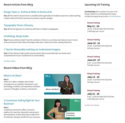
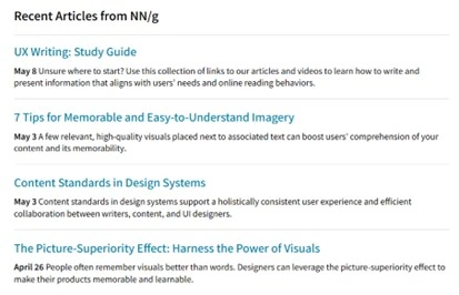
The Nielsen Norman Group’s content layout maintains an easy-to-navigate page with a “Recent Articles”, “Recent Videos”, and “Upcoming UX Training” section. Each is neatly aligned to make it easy to tell where each begins and ends.
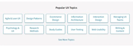
To help break up the content layout while maintaining the interactivity of the site, there is a “Popular UX Topics” section featuring navigation buttons for users who have a particular UX topic in mind.
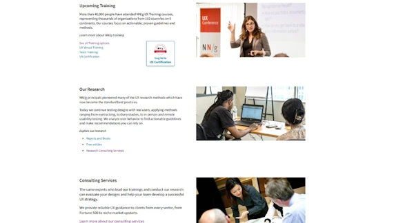
After the “Popular UX Topics” break, the content layout at Nielsen Norman Group returns to a neat grid with text and images. One great thing to note is that the Nielsen Norman Group continues to offer quick links here, so that there’s continued opportunity for user engagement.
Visual Hierarchy
Visual hierarchy involves the placing, sizing, and organizing of various elements to help imply their importance to users.
For the Nielsen Norman Group homepage, visual hierarchy is well-established through the deployment of large and well-contrasted elements near the top, drawing the user’s attention especially to the banner image with two highly visible buttons for “Upcoming Courses” and “All Courses”. Using size and color, this serves to help guide users to the site’s main service of training and UX certifications.

Further down the homepage, the “Articles”, “Videos”, and “UX Training” columns are cleanly aligned and clearly sectioned thanks to the balanced use of white space and distancing.
Balance and Contrast
Balance and contrast are about creating a webpage that’s both visually engaging and highly functional. Balance involves the different ways that visual elements can be distributed on a webpage. Contrast plays its part by helping different elements stand out when compared to others, which can be effective for drawing the eye to where you want to guide your users.
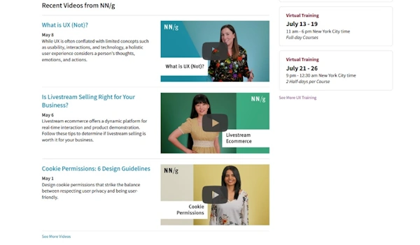
The Nielsen Norman Group accomplishes balance and contrast effectively with their homepage. Well-contrasted and interactive buttons draw the user’s attention and lead the users straight to one of their main services, accelerating the user journey. Looking at the site as a grid, any sets of text and images are well balanced into two easy-to-follow columns (for example, “Articles” are aligned to a left column while “Upcoming UX Training” is neatly aligned to the right. All of it follows a neat grid system, ensuring that all these elements remain structured and organized.
Interactive Elements
Interactive elements play a crucial role in a webpage or application’s content layout by providing enhanced visual interest, influencing how users navigate, supporting accessibility, and improving usability.
Nielsen Norman Group successfully brings interactive elements into their content layout. Their header nav contains some dropdown menus and main links to improve usability and reduce cognitive load, only offering more options or further navigation to more info when the user desires to see them. The same goes for having each listed article, video, or training program be made clickable so that the user remains engaged while choosing when to access further information.

Typography
Typography in a content layout impacts a webpage or application’s useability in its readability, aesthetic appeal, and it plays a role in establishing a clear visual hierarchy.
The Nielsen Norman Group effectively leverages typography to help establish hierarchy and improve readability. Bold and larger font helps guide the users to the head of each section (Articles, Videos, Training, Popular UX Topics, etc) while use of color help indicate interactive fields to the users.
FAQS
Are There Any Legal Considerations When Designing Content Layouts?
The legal considerations to keep in mind when designing content layouts such as accessibility, copyright laws, privacy and data protection regulations, and even laws that may surround advertising practices.
What Are the Best Practices for Content Layout in UX design?
The best practices for content layout include establishing content importance with a clear visual hierarchy, ensuring consistency across all pages on a website or application interface, find opportunities to enhance readability and accessibility, utilize white space in a balanced and effective manner, adopt a responsive design, conduct user testing and user research.
How Can Dynamic Content Be Effectively Integrated into Content Layouts?
Dynamic content can be effectively integrated into content layouts by using thorough user research to determine the types of dynamic content you include. This dynamic content may include personalized information that uses the user’s profile or content that adapts to the user’s behavior as they interact with the webpage or application.
Revisit A Section
- What is Content Layout in UX Design?
- Why is Content Layout Important in UX Design?
- Content Layout Enhances Readability and Comprehension
- Content Layout Improves Usability
- Content Layout Improves Navigation
- What are the Key Principles of Content Layout in UX Design?
- Establishing a Visual Hierarchy
- Consistency in Content Layout
- Using Grid Systems and Alignmen
- Adopting a Responsive Design
- Focusing on User Needs
- The History and Evolution of Content Layouts
- The Early Days (1990s)
- The Rise of Web and Mobile Interfaces (Late 90s to Early 2000s)
- Web 2.0 and Early Mobile UX (Mid-2000s)
- A Focus on User-Centered Design (2010s to Present Day)
- How Does Content Layout Influence User Experience?
- How to Analyze User Behavior for UX Design?
- User Surveys
- Usability Testing
- Web Analytics
- Heatmaps
- Session Recordings
- What are the Challenges of Balancing Text and Visuals in a Content Layout?
- What Are Common Mistakes in Creating Content Layouts in UX Design?
- Cluttered Layouts
- Inconsistent Design
- Poor Readability
- Not Having a Clear Visual Hierarchy
- Ignoring Accessibility
- What Are Some Examples of Proper Content Layouts in UX Design?
- Who Is the Nielsen Norman Group
- Content Layout at the Nielsen Norman Group
- Visual Hierarchy
- Balance and Contrast
- Interactive Elements
- Typography
- FAQS
- Are There Any Legal Considerations When Designing Content Layouts?
- What Are the Best Practices for Content Layout in UX design?
- How Can Dynamic Content Be Effectively Integrated into Content Layouts?
